
Winterstck
WINTERSTICK SNOWBOARDS
Creative Director at Kevin McPhee and Associates
How to take a legacy brand’s heritage and translate it into a modern, focused identity—combining real backcountry credibility with clear consumer targets, refined design, and a cohesive visual language that strengthens both product storytelling and marketing.
I worked with Winterstick to develop their first holistic brand and marketing foundation, shifting them from a one-off cottage business to a more unified identity. I helped define their core consumer, clarify their market position, and translate their backcountry legacy into a modern design direction. The result was a cohesive visual system, refined board graphics, and a catalog built around real riders, authentic terrain, and the technology that sets the brand apart.

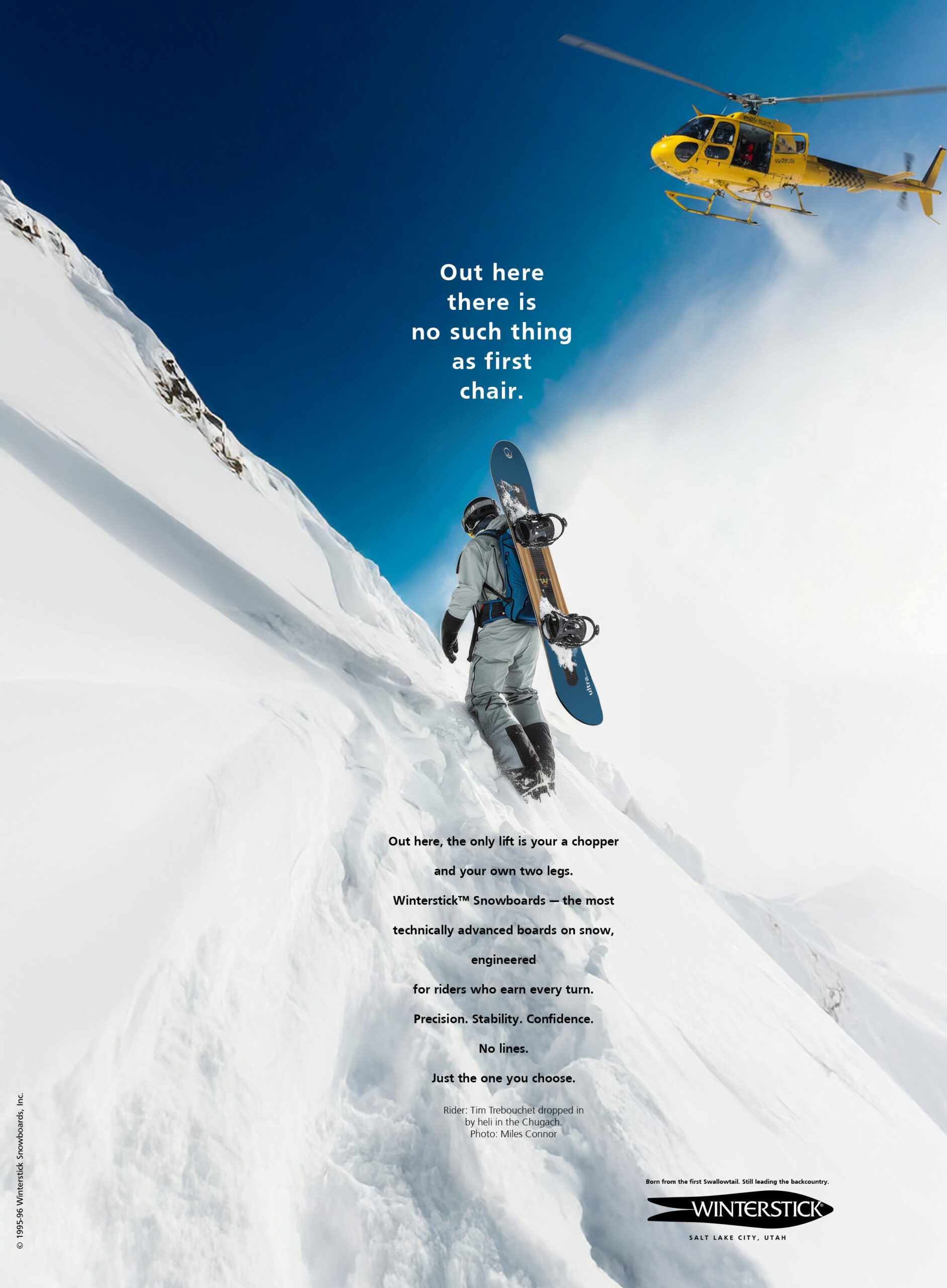
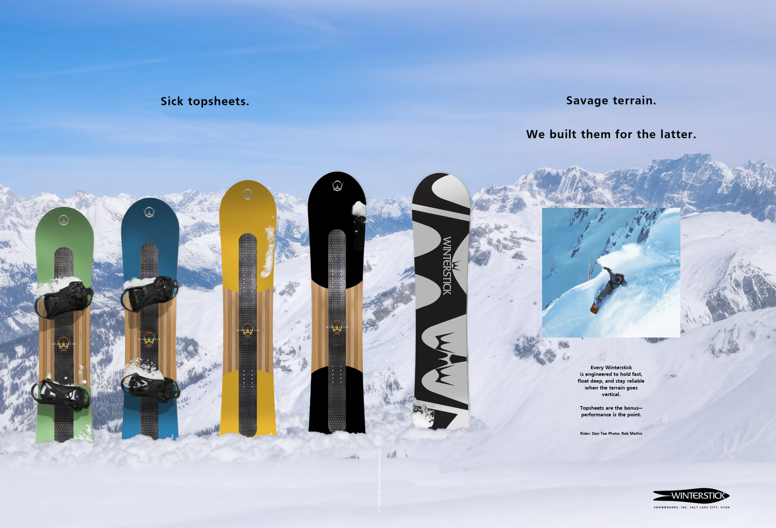
Above, their ads and logo before reaching out to me.
Below, a refreshed logo that refined their logotype and incorporated the outline of their iconic Swallowtail board.

The Advertising
A campaign that speaks directly to the backcountry soul of the sport.
quiet minimal typography,
and strong, no-bs statements


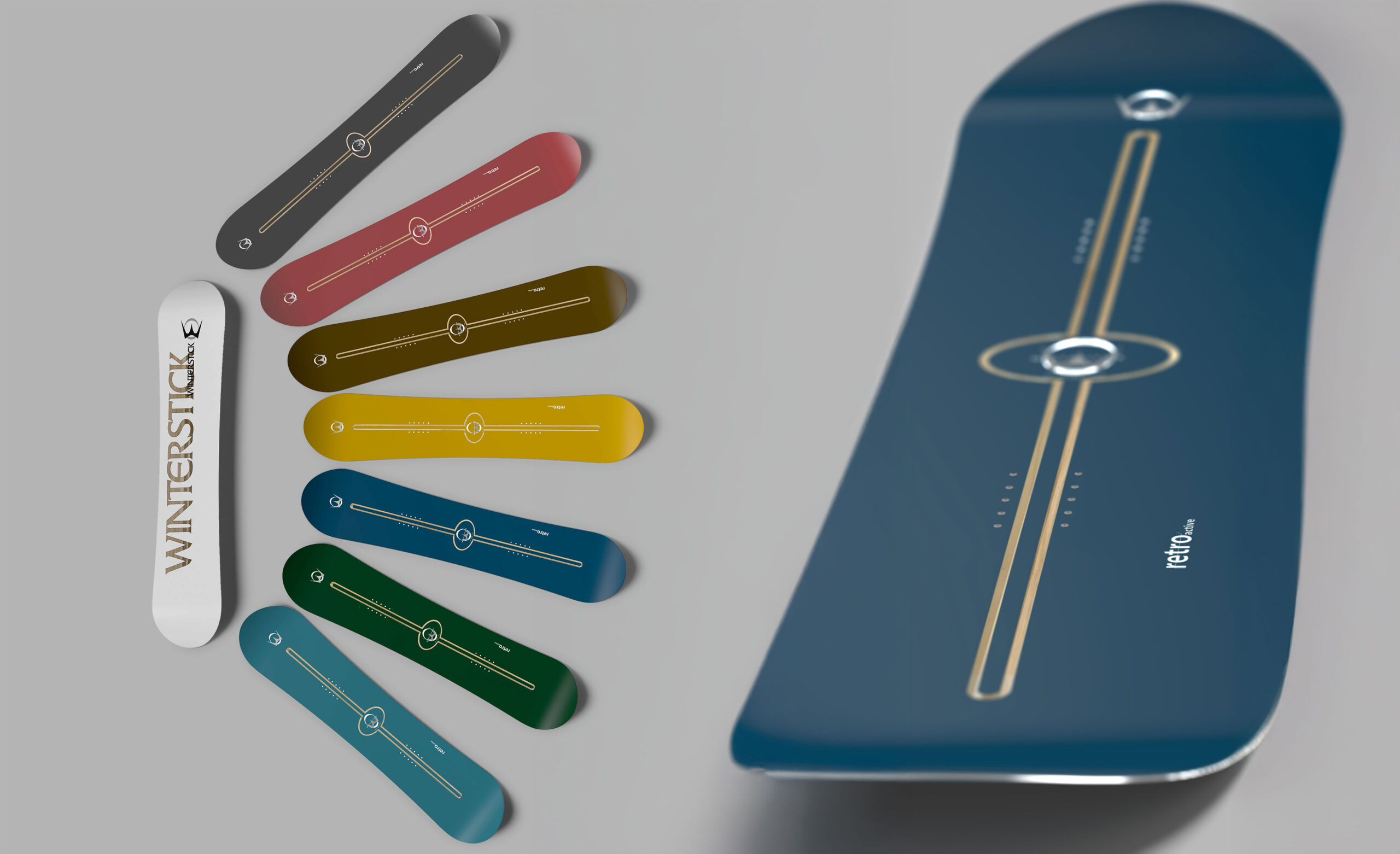
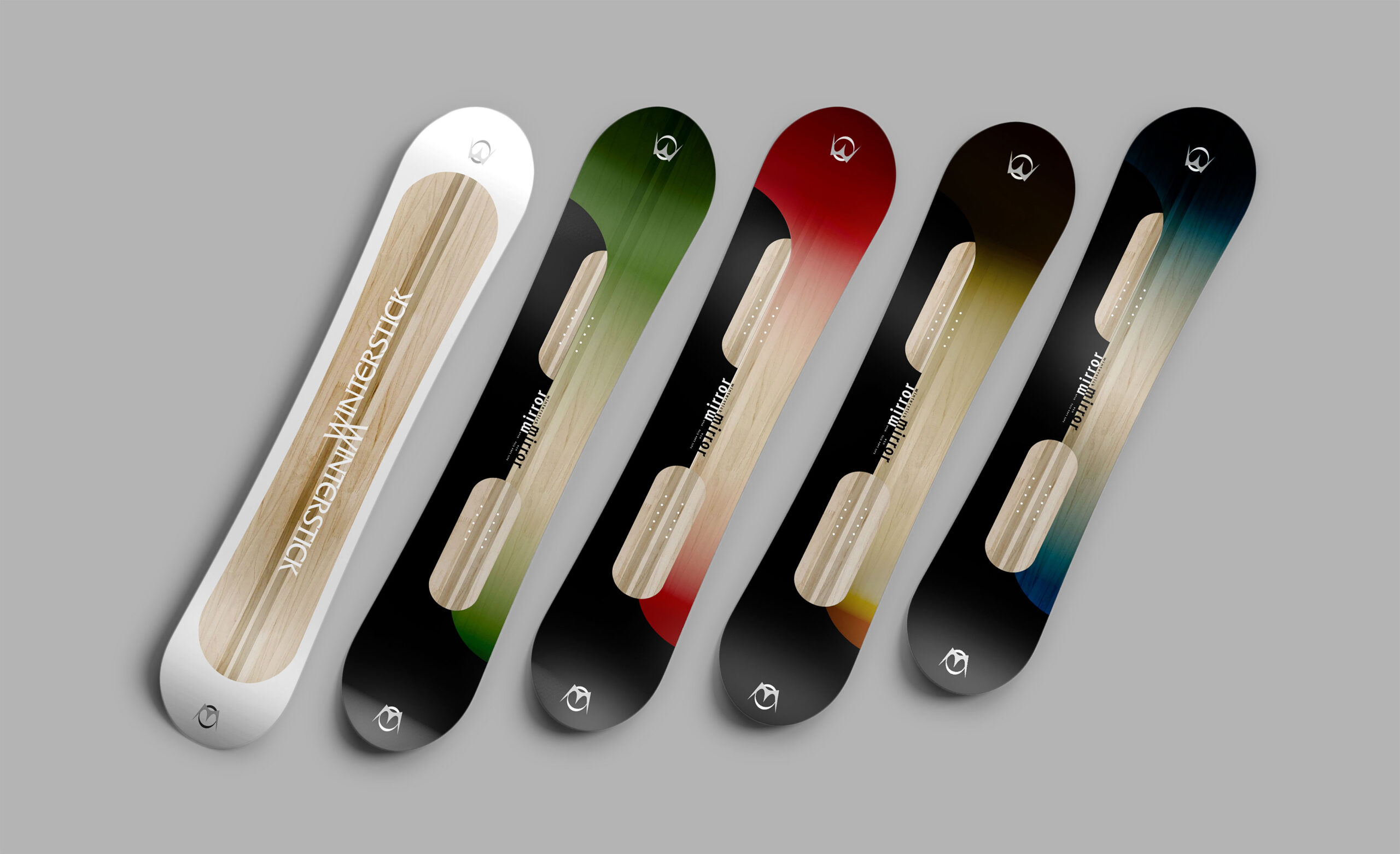
The Boards
Five collections with distinct rider personalities, unified through complementary colorways and a consistent graphic approach. The designs lean modern and refined, avoiding the loud, skatepark graphic trends common in other brands. Each board incorporates a transparent window that showcases the construction beneath.
unified design language,
and distinctive elevated attitude


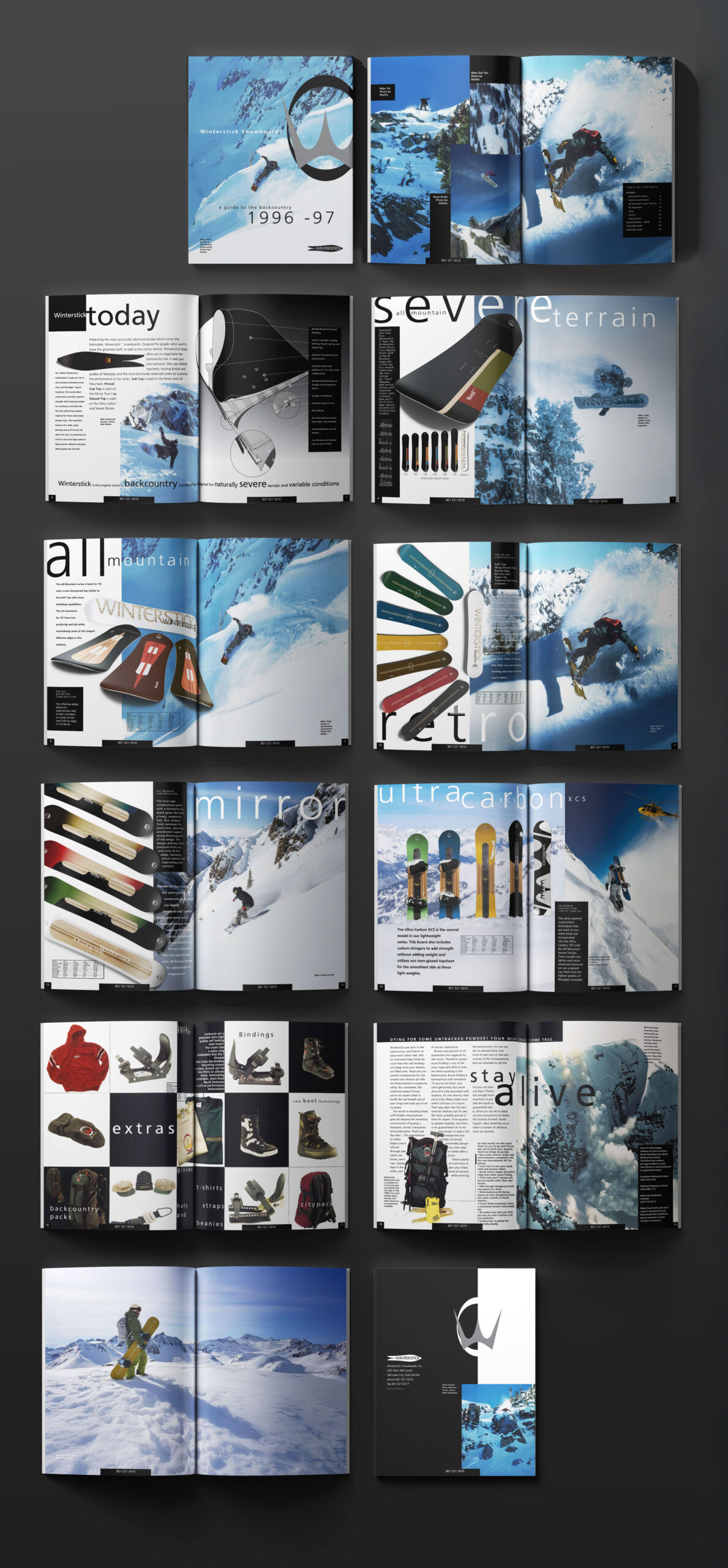
The Catalog
A clear presentation of Winterstick technology and dynamic backcountry imagery, reaching a broad audience while staying rooted in core enthusiast culture.
techically-forward presentation,
and aspirational imagery

A peek at the board designs for the next year that never made it to production.