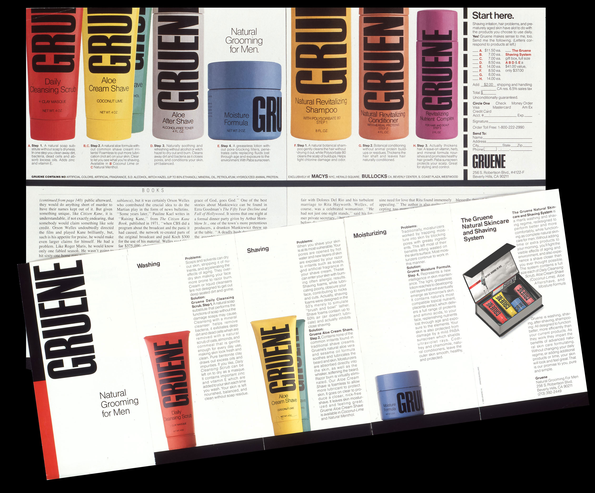
Gruene
Gruene Grooming for Men
Freelance Designer
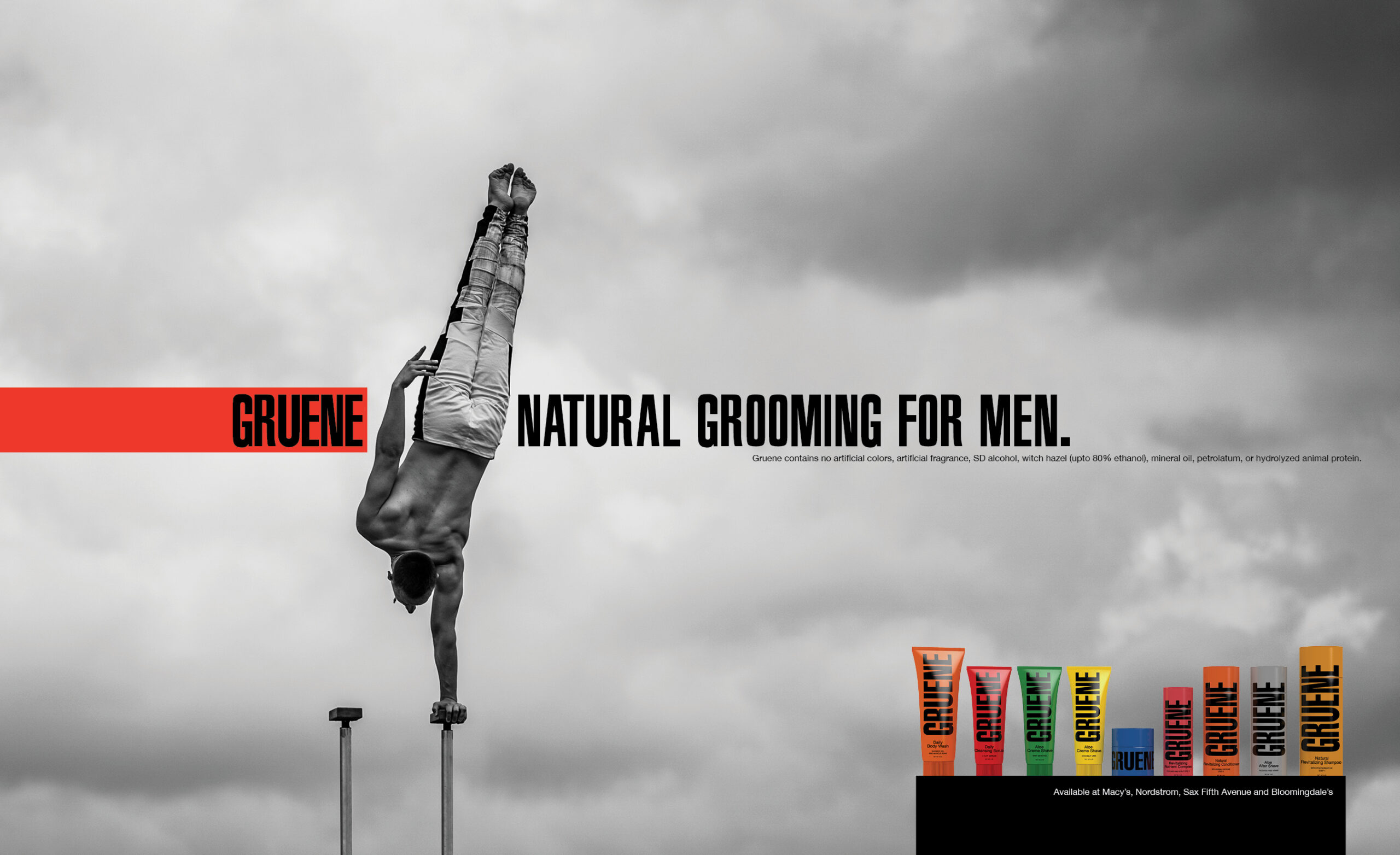
Men’s brands don’t have to rely on dark wood, muted tones, or gentleman’s-club clichés. Sometimes the most powerful statement is bold, colorful, and unapologetically energetic.
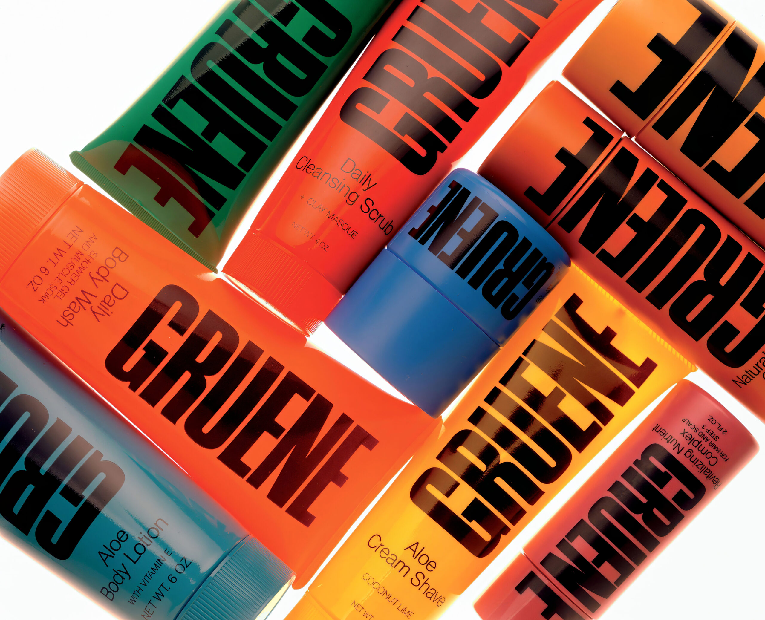
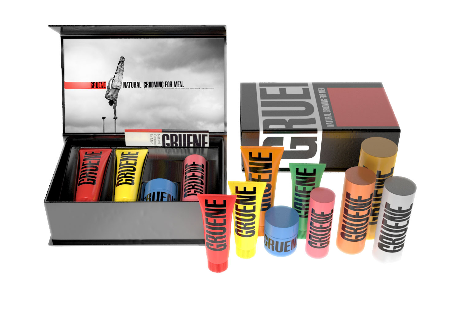
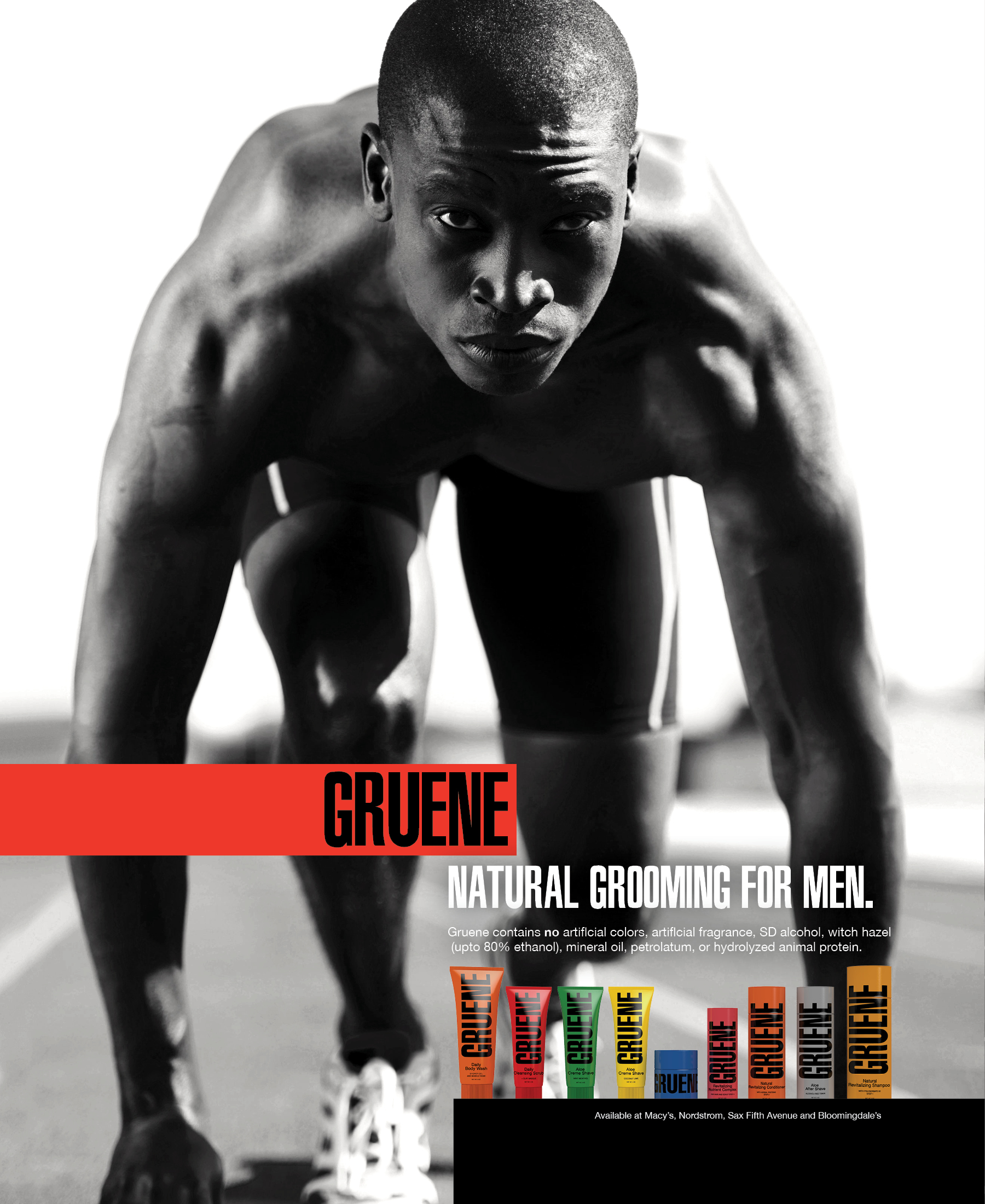
When men’s skincare was dominated by dull greens and grays, Gruene broke through with a vibrant, sporty identity—primary colors, bold type, and natural ingredients for the health-conscious man. They reframed skincare as part of total wellness, pairing eye-catching packaging with dynamic, sports-driven black-and-white imagery that made their products impossible to ignore.
The advertising and in-store branding featured dynamic, sports-focused black-and-white imagery, creating a striking contrast with the vibrant, colorful product lineup.
CCO: Rochelle Udell
Packaging and Graphic Design: Kevin McPhee

Below: paraphrased from The Los Angeles Times, Nov. 20, 1988
By the late ’80s, men’s skincare had grown into a $1.3-billion business, with department store sales jumping more than 14% in a single year. Gruene’s founder predicted makeup for men was still decades away, but skin health was becoming part of the new fitness mindset. Many men first tried products at the urging of wives or girlfriends and preferred guidance from female sales staff. Price was still a sticking point—yet as one man put it, premium brands “set up my beard better and moisturize all day instead of drying my face.” Another summed it up: skincare “feels healthy—like working out or eating right—but you’d never talk to another guy about it.”
The West Coast-based Gruene company dispenses an assortment of products in vivid containers
that are color-coded to denote their function.
The New York Times Magazine, Oct. 26, 1986