Shot in black and white. A :45 film built around a single idea — that control is its own kind of power.
CalibR
CalibR
ONE BODY. EVERY ZONE.
Kevin McPhee Creative
CalibR reinforced that the strongest product stories are the ones where the object itself makes the argument. The flat aluminum form, the magnetic system, the ghost charge display — none of these needed explanation. They needed framing. The challenge was to build a brand, a campaign, and a retail environment precise enough to let the product speak at the level it deserved.
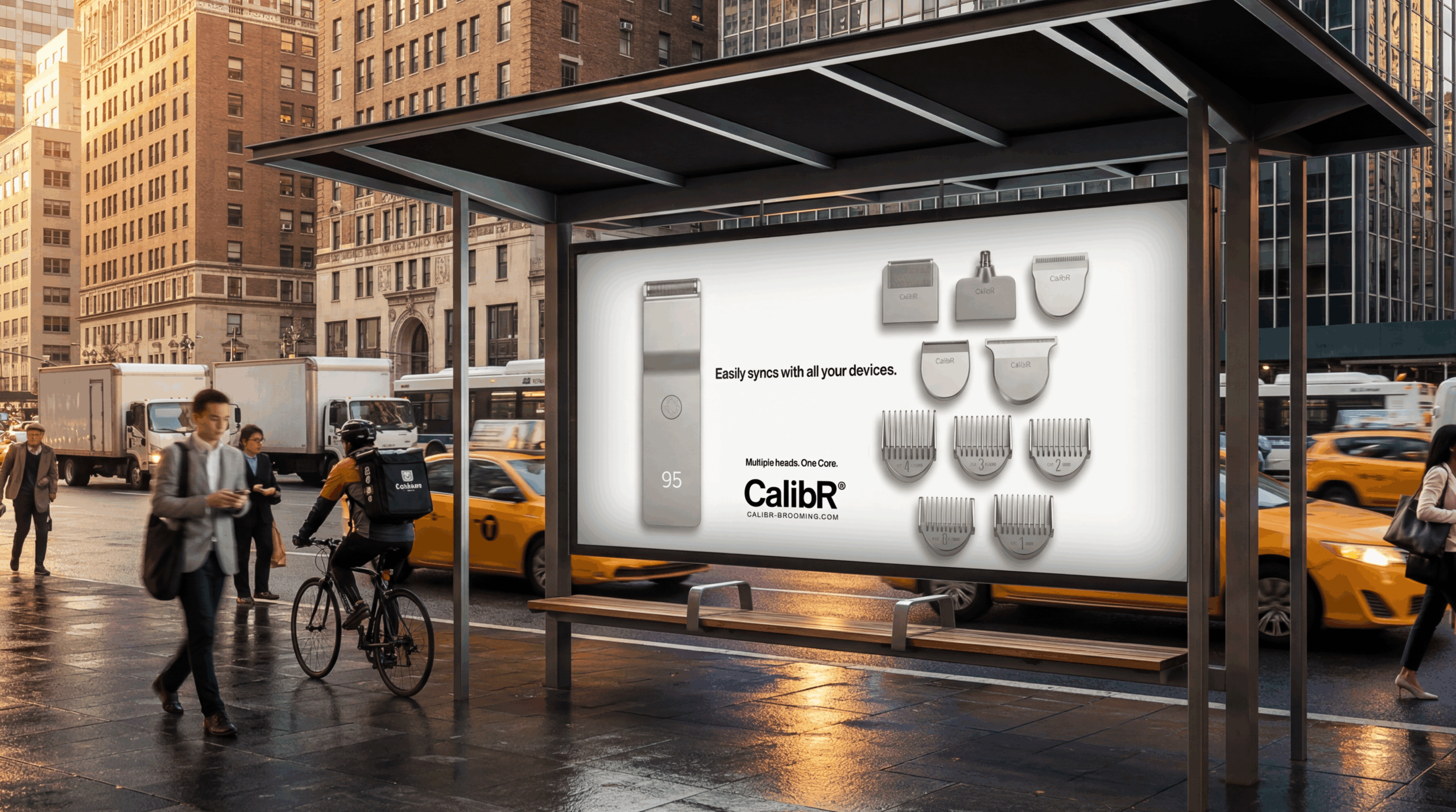
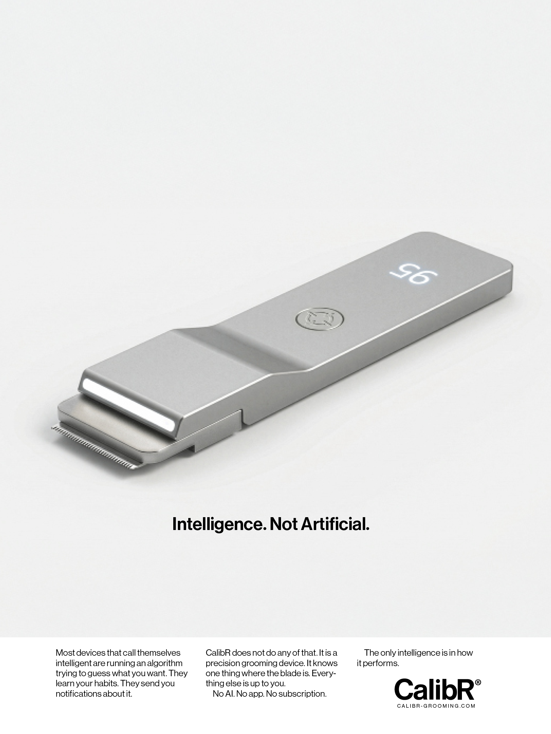
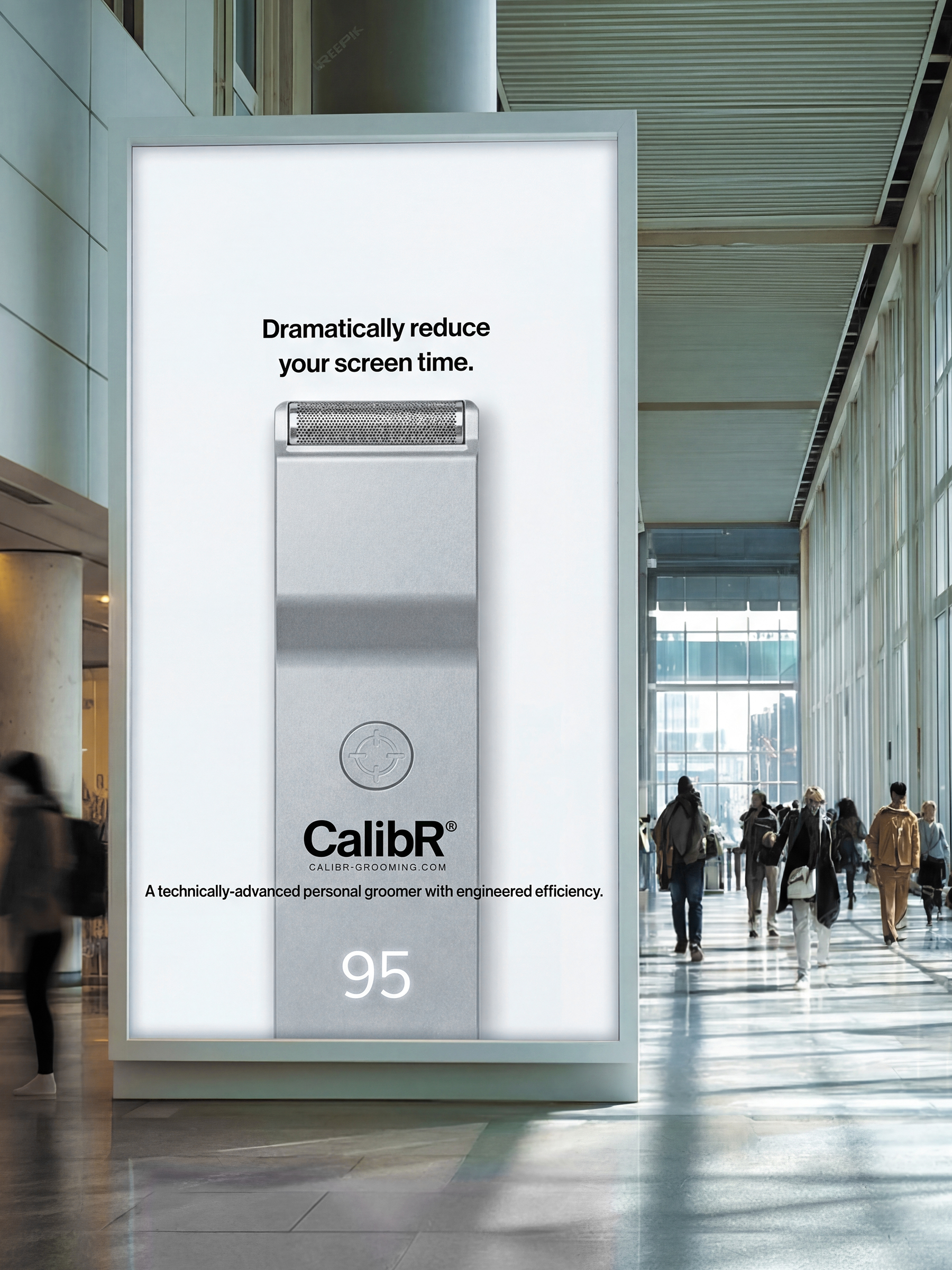
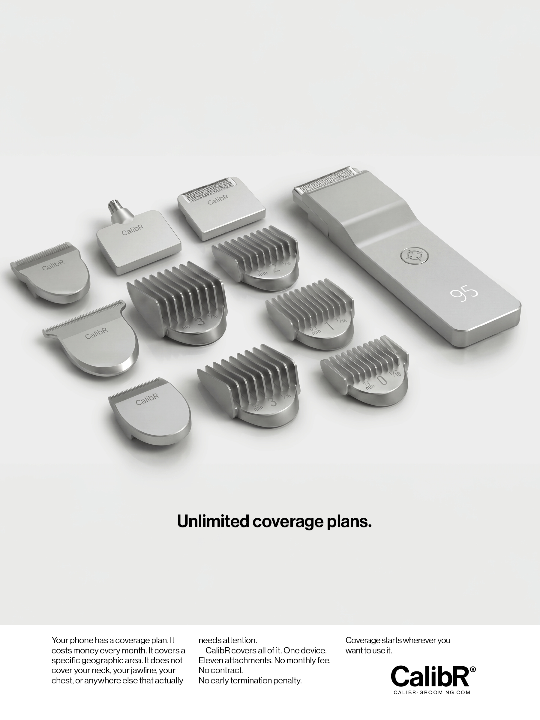
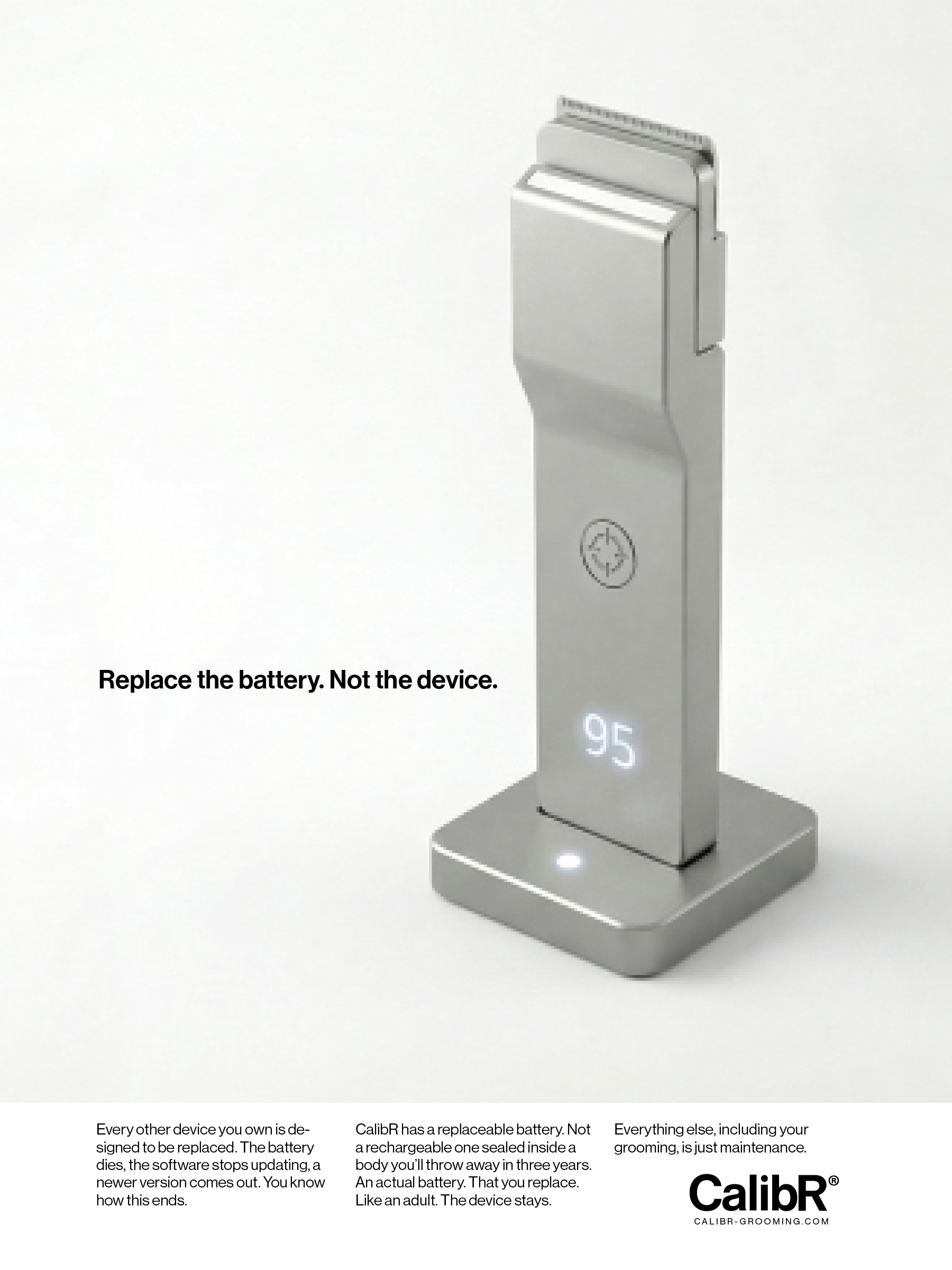
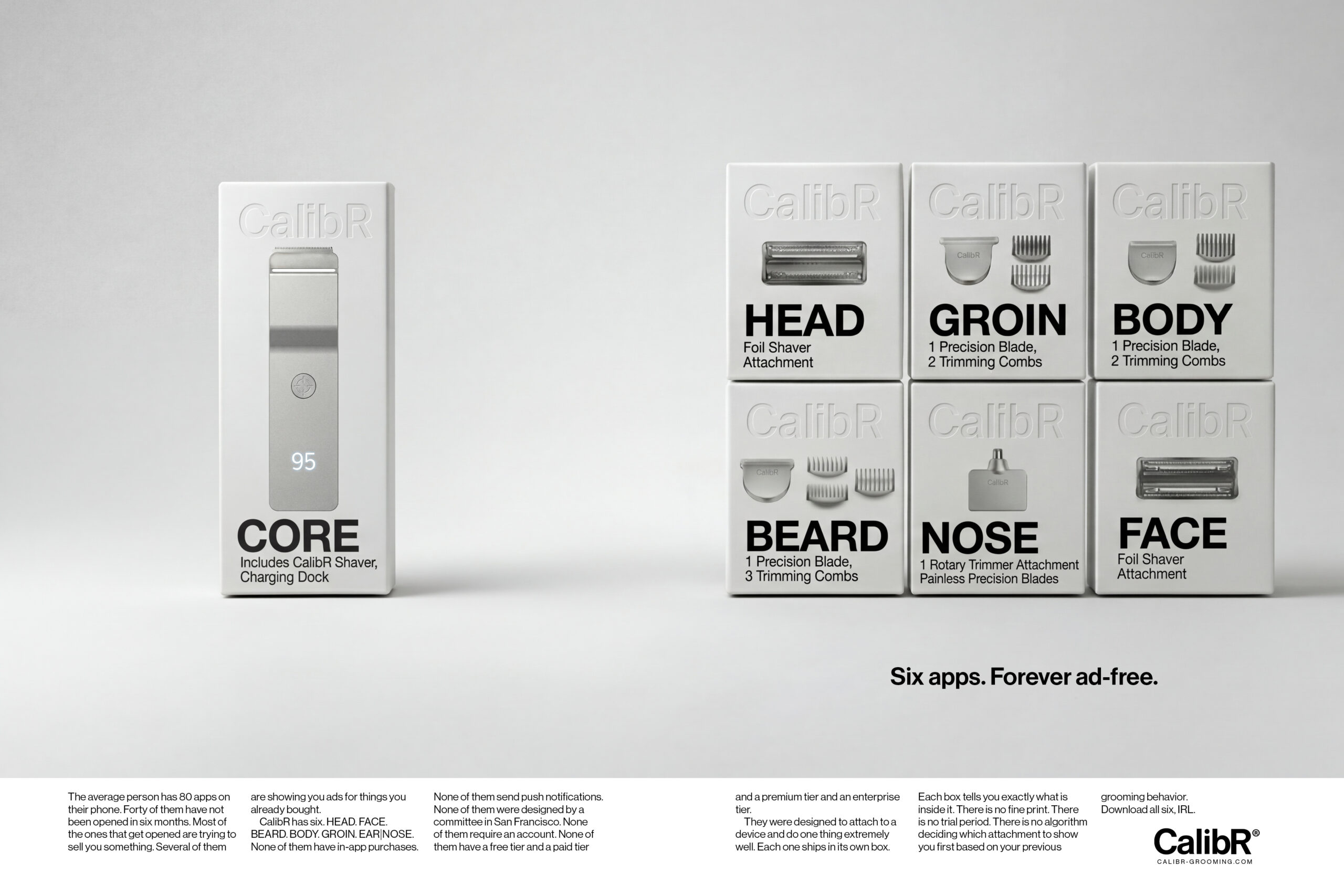
CalibR is a flat aluminum grooming system built around a single modular handle and six precision head collections — HEAD, FACE, BEARD, BODY, GROIN, and EAR | NOSE. Each head magnetically attaches to the CORE unit, which charges wirelessly and displays battery level through a ghost charge display embedded in the aluminum surface.
Every other system makes you own multiple devices, manage multiple batteries, find counter space for multiple chargers. CalibR solves it once. One body. One charge. Every zone.
The material is matte bead-blasted aluminum. The form factor is borrowed from precision instruments. The brand name carries the founder’s name — Calib R. — embedded in the product identity from the start.
Product Design, Brand, Advertising, Retail: Kevin McPhee
THE DEVICE AND SYSTEM
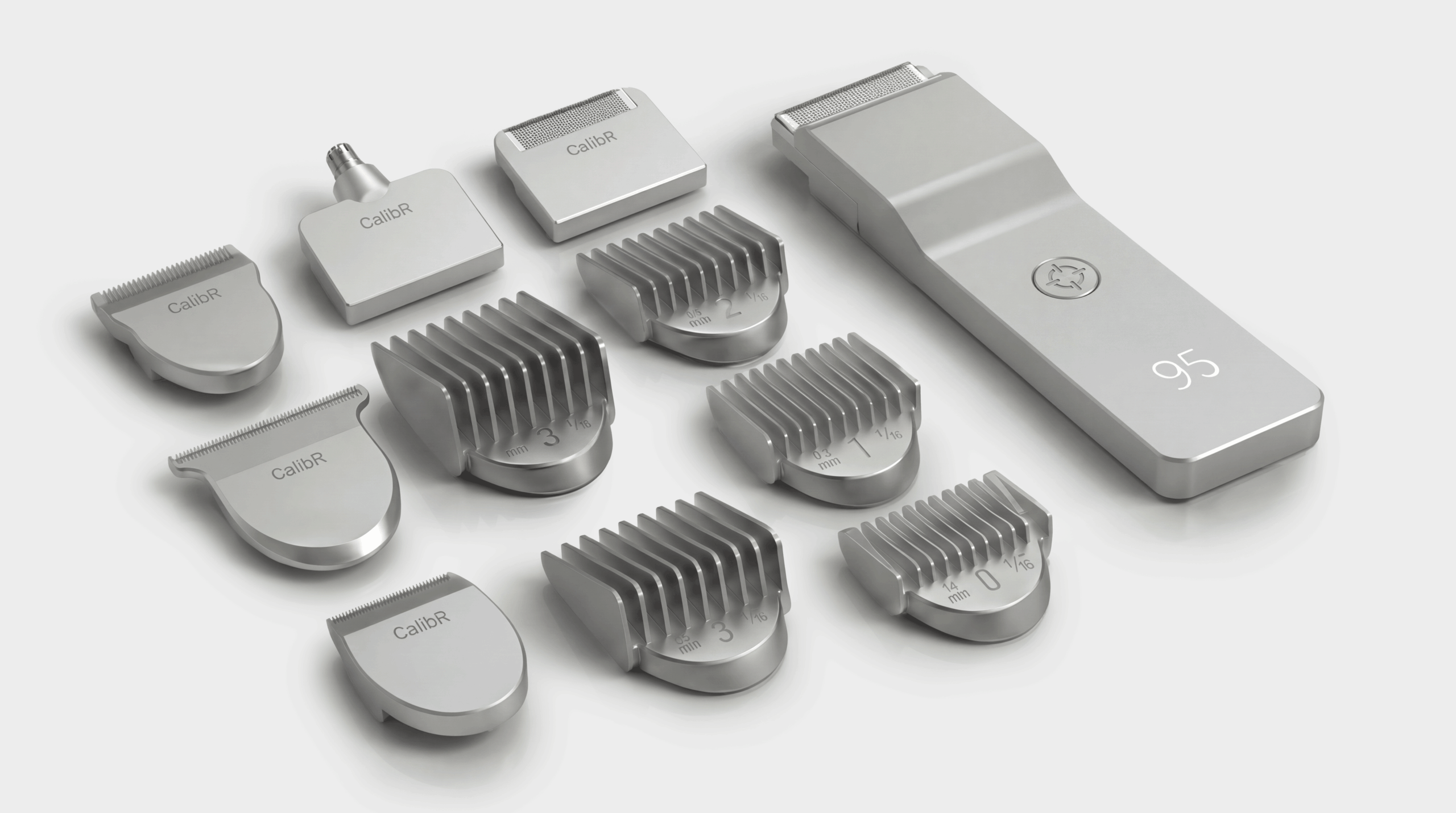
One CORE unit. Six precision head collections. HEAD, FACE, BEARD, BODY, GROIN, EAR | NOSE — each magnetically attached, each engineered for its zone.
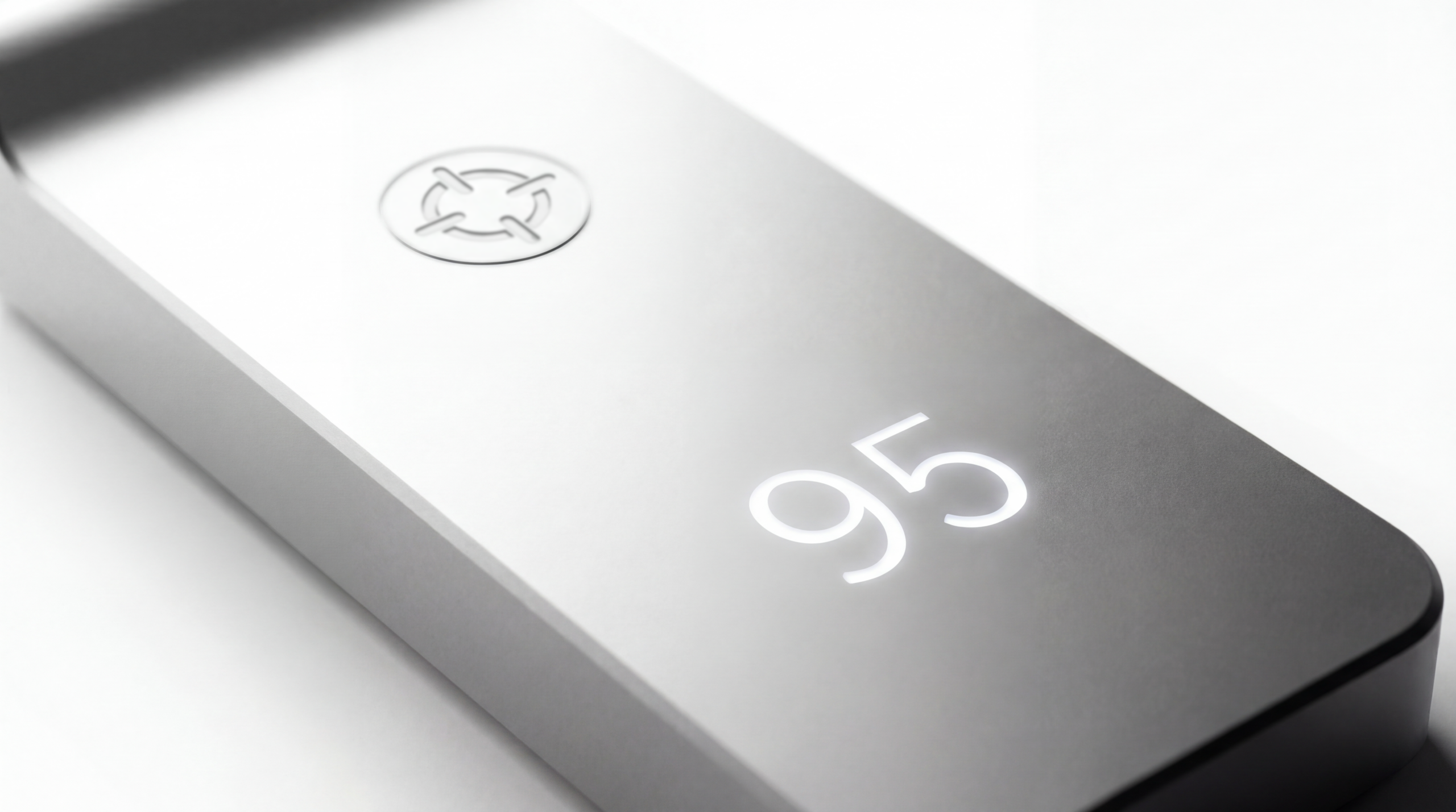
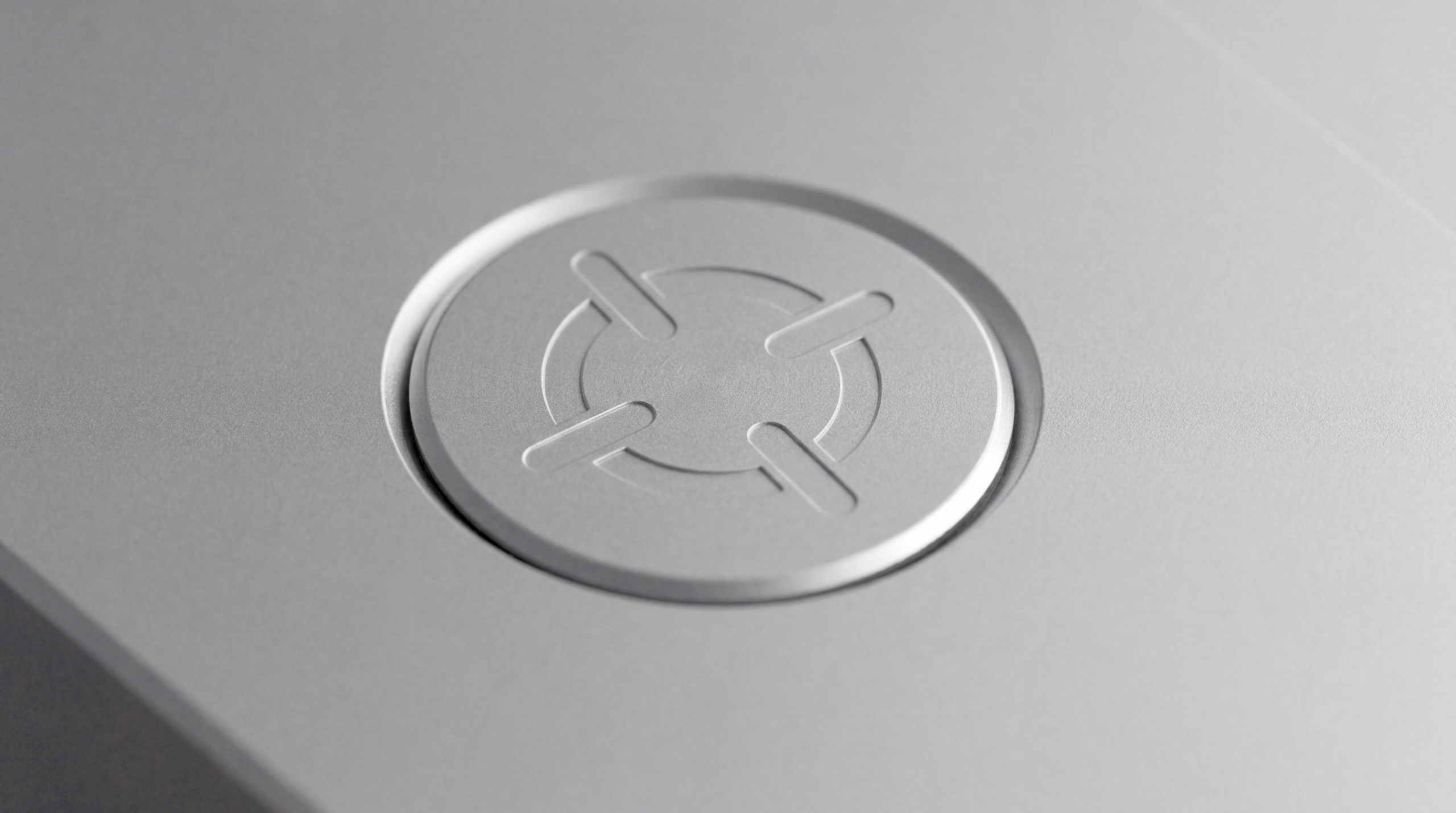
The ghost charge display — battery level rendered through the aluminum surface.
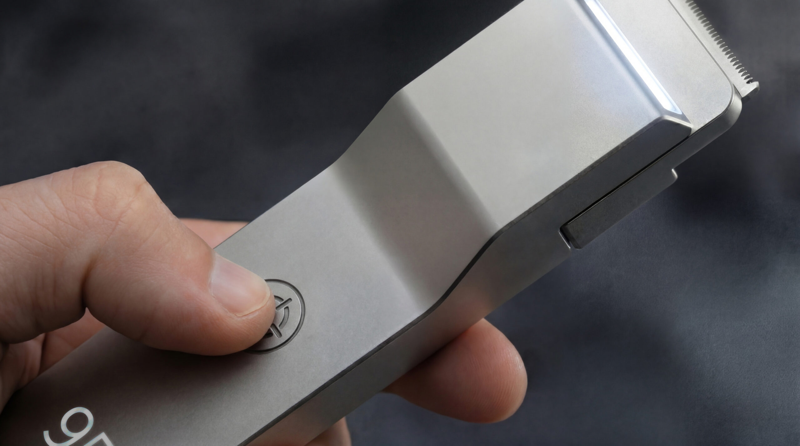
The crosshair replaces the power symbol — pressed into brushed aluminum, present every time the device is used.
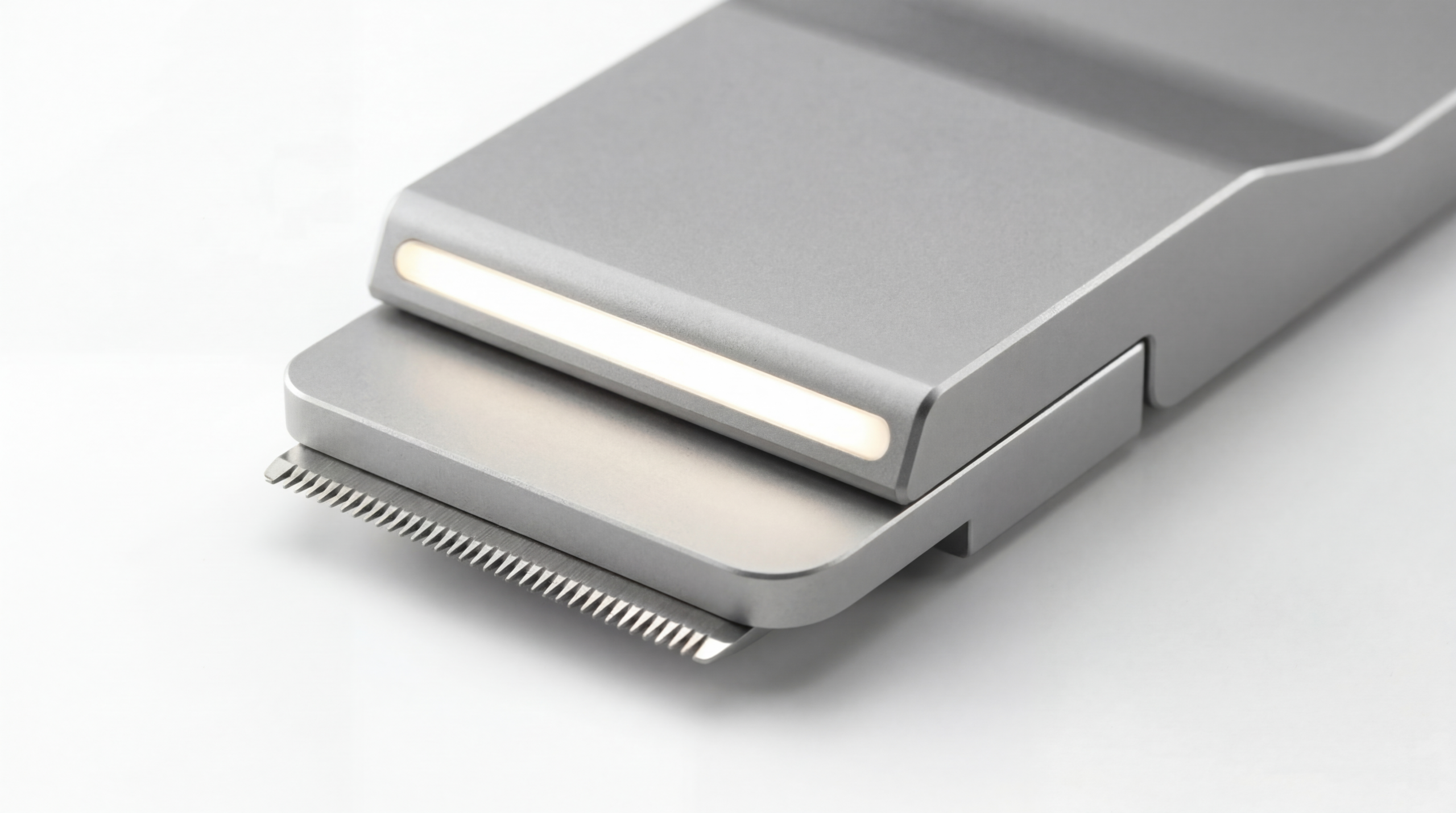
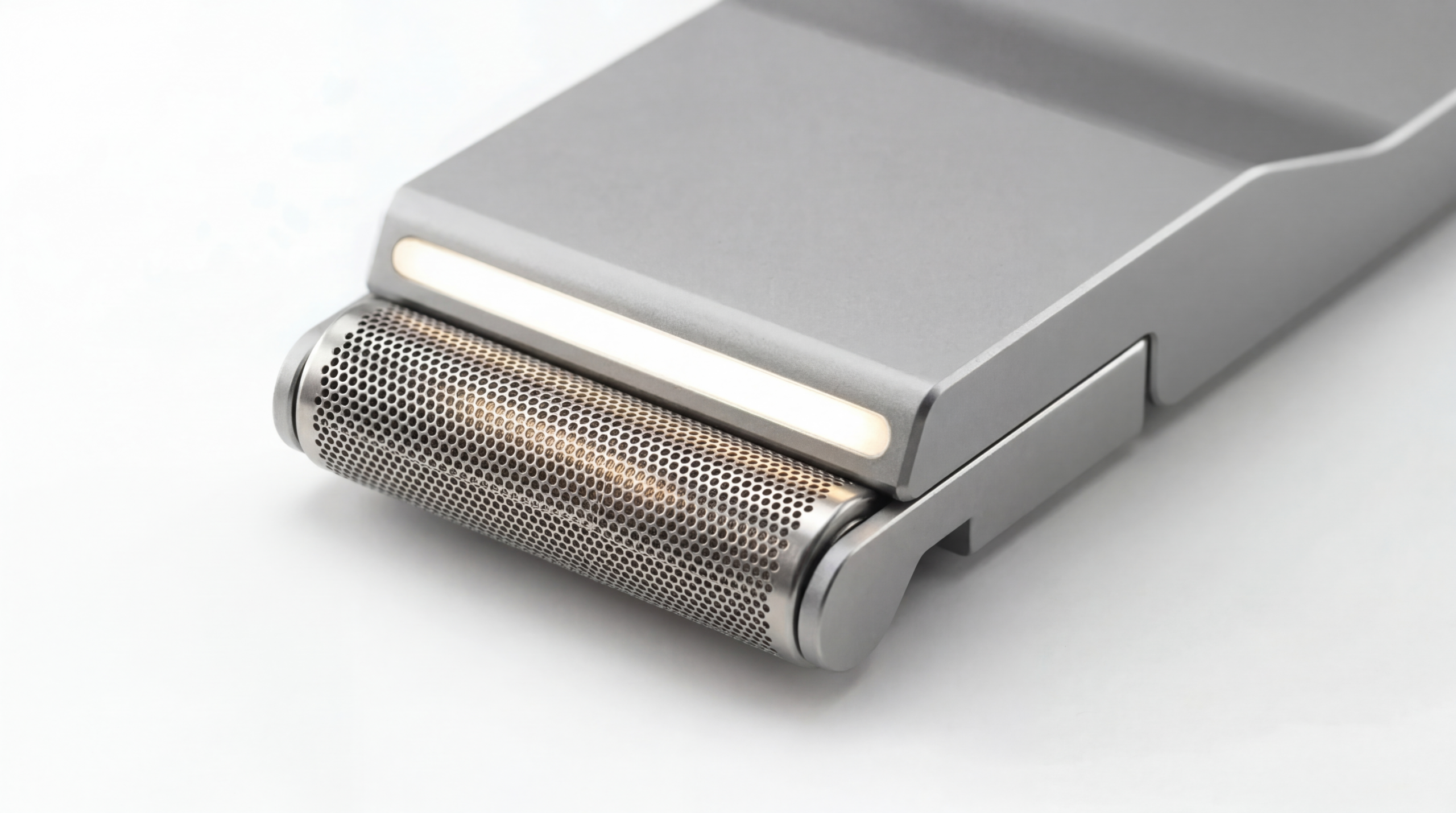
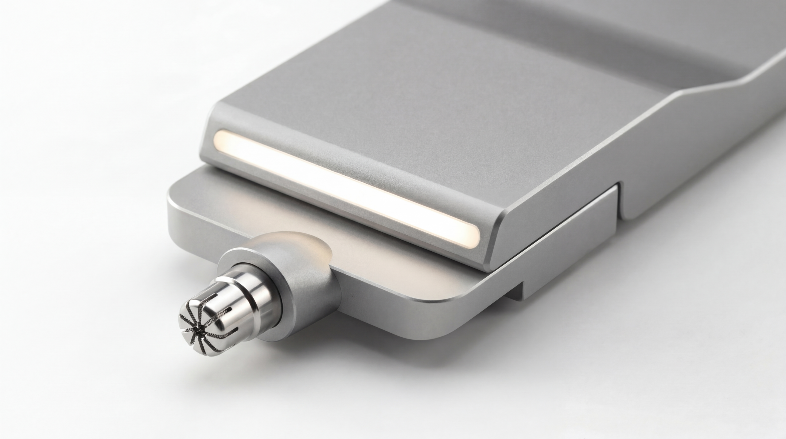
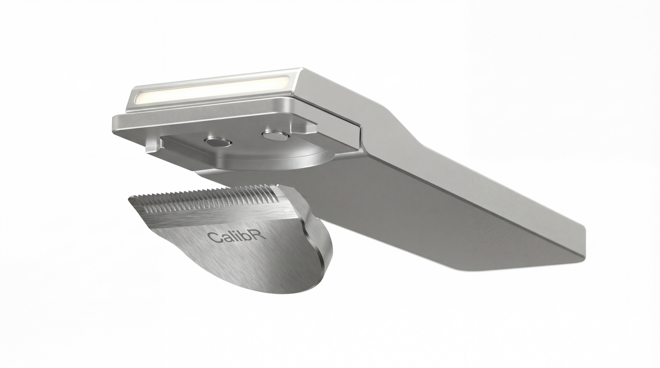
BEARD blade. · HEAD foil. · EAR | NOSE rotary. · Magnetic attachment.
THE PACKAGING SYSTEM
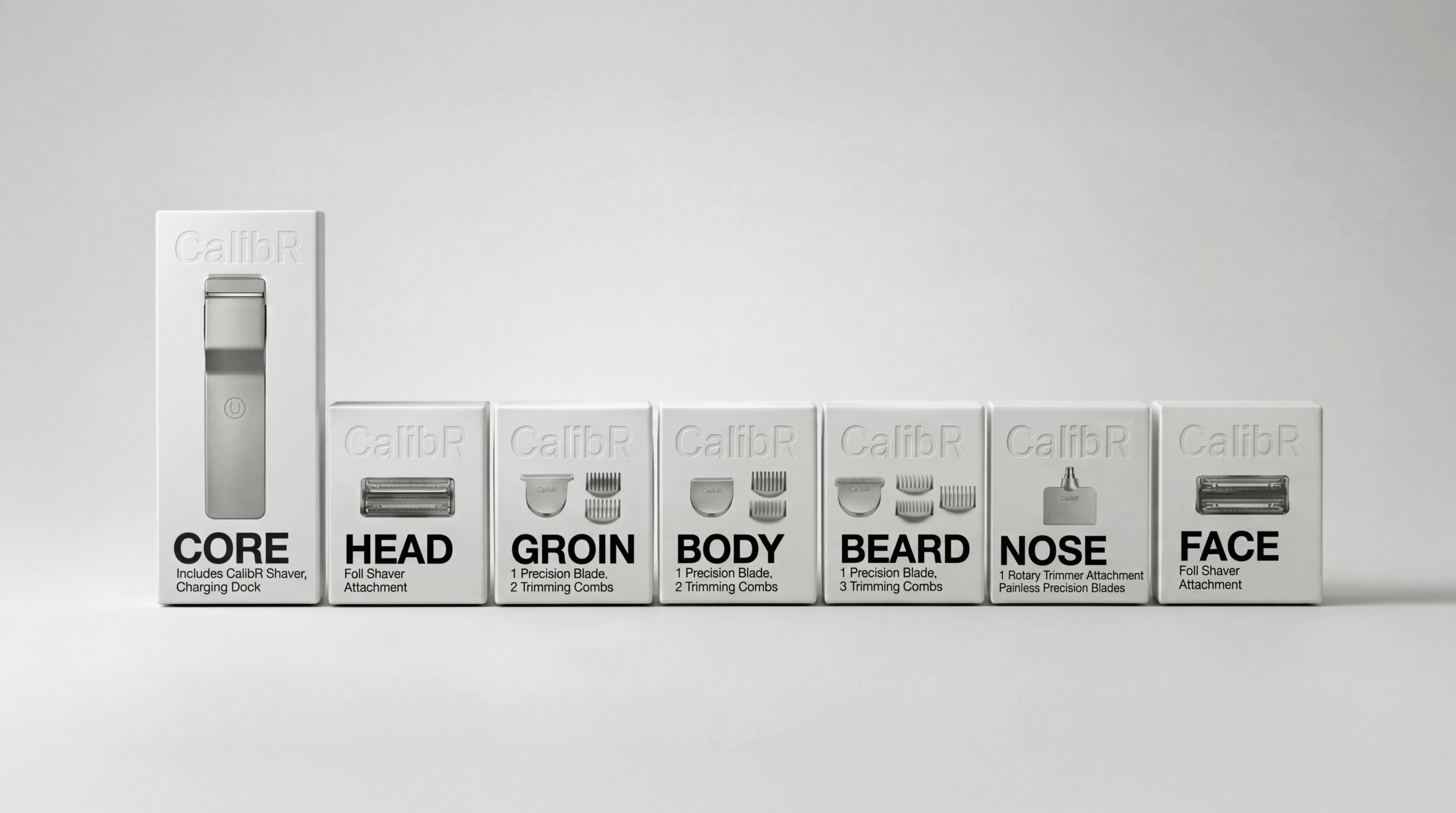
CORE. HEAD. GROIN. BODY. BEARD. NOSE. FACE. Each carries its zone name as the dominant typographic element. The category system visible at shelf from ten feet.
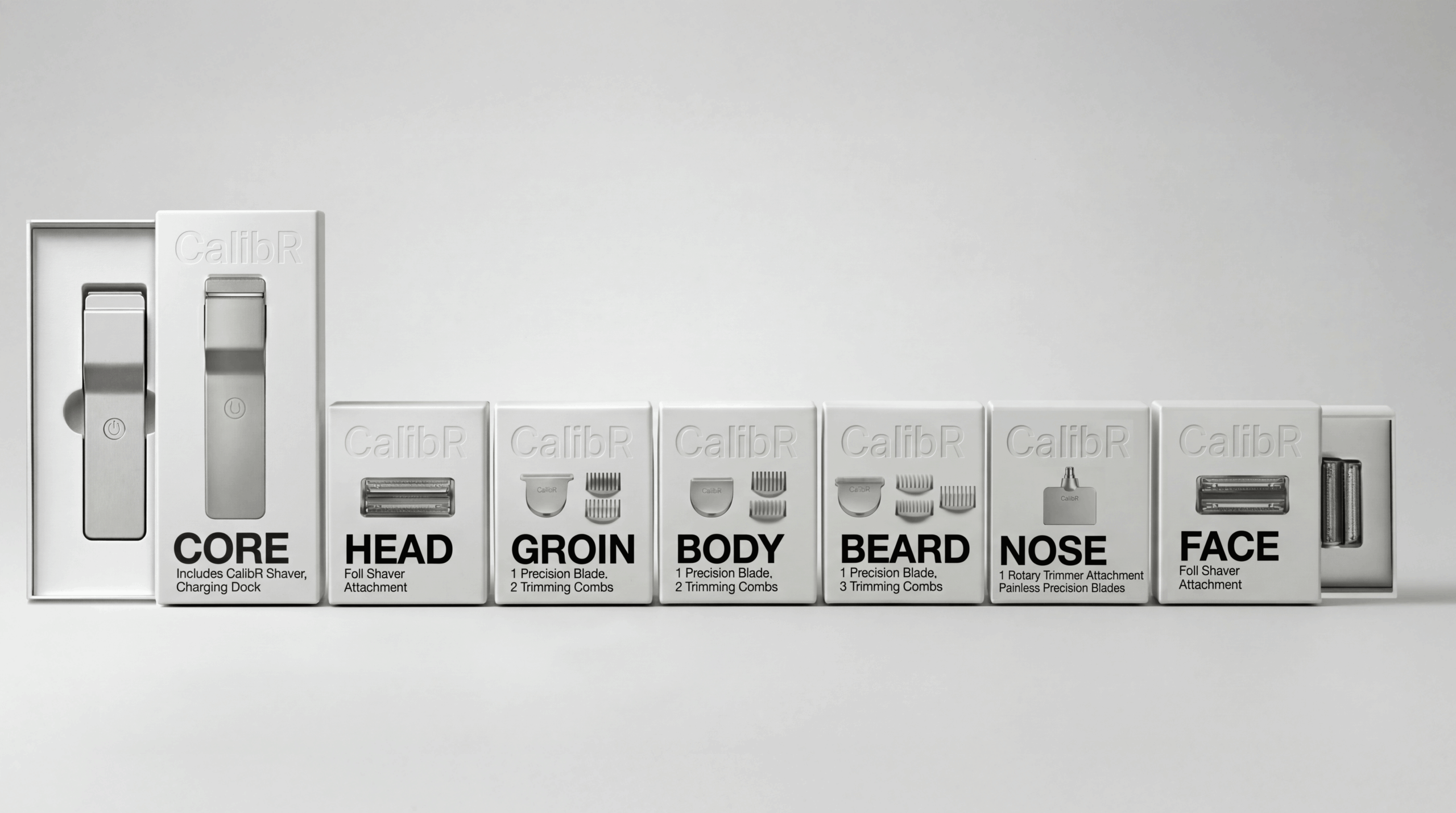
White slip-case packaging. Two head packages equal the height of one CORE package. The system logic made physical.
The Landing Strip
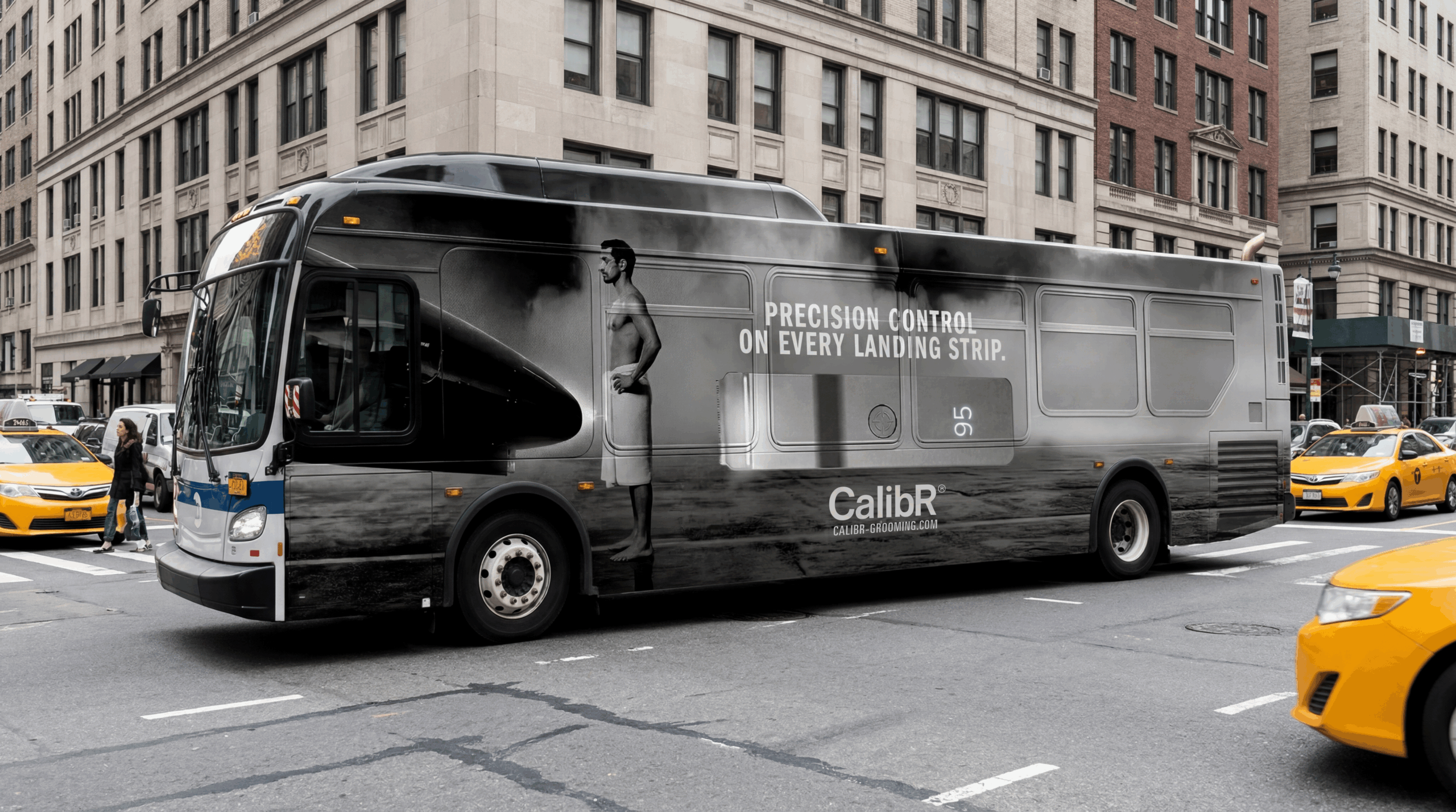
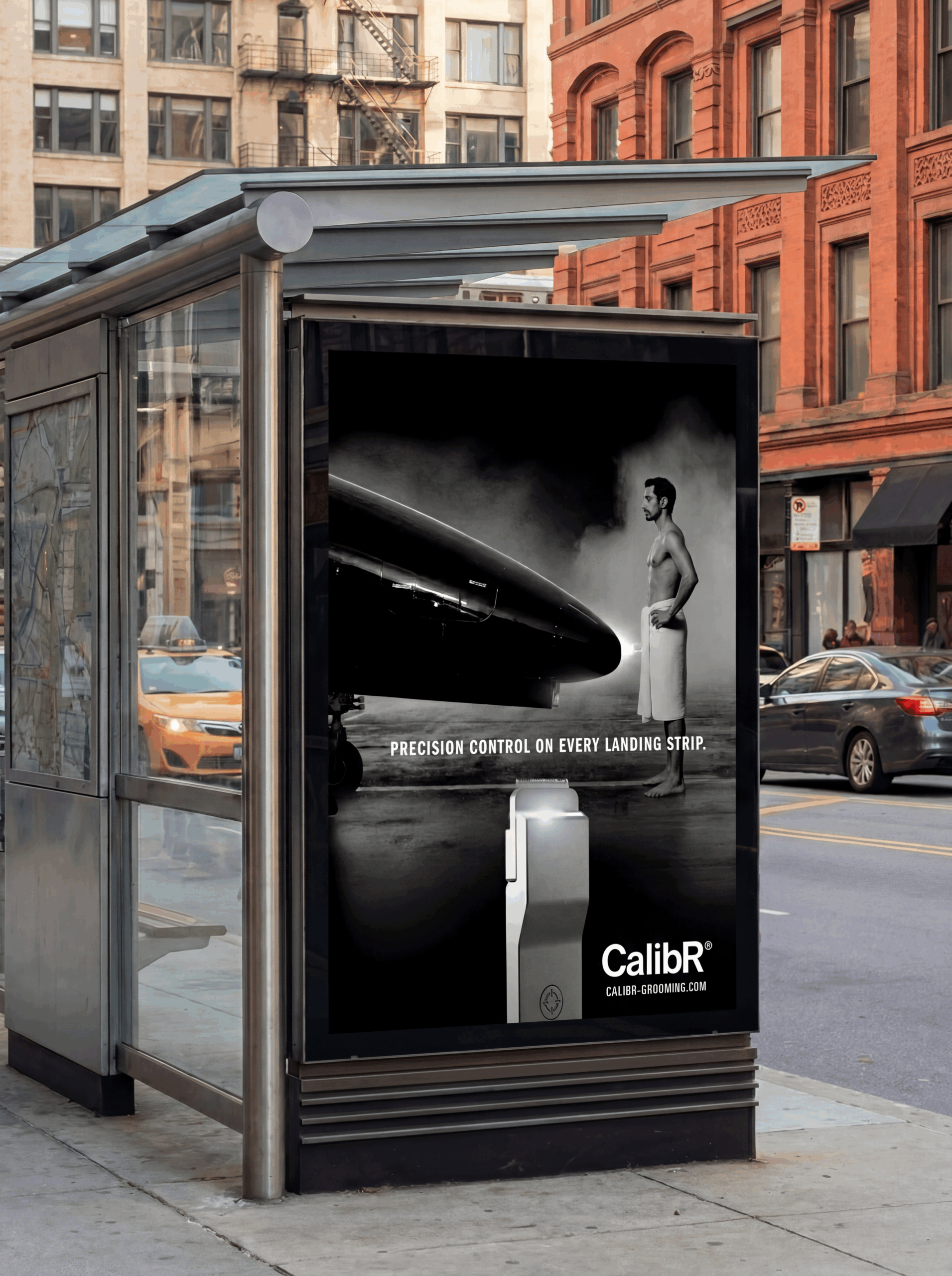
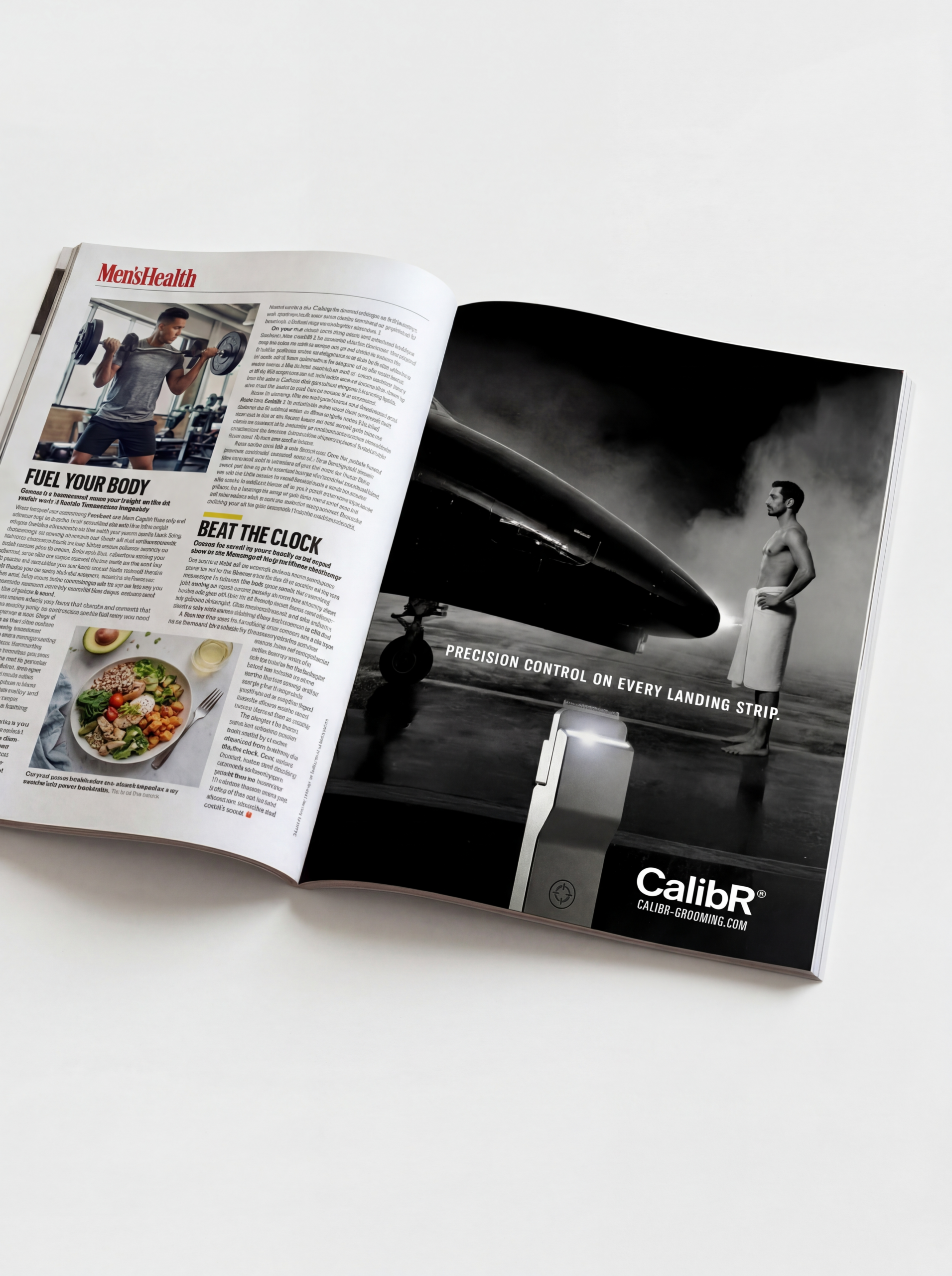
The Spot
THE CAMPAIGNS
The Device as Tech
CalibR one is waiting by the sink and in the shower.
THE SHOPS
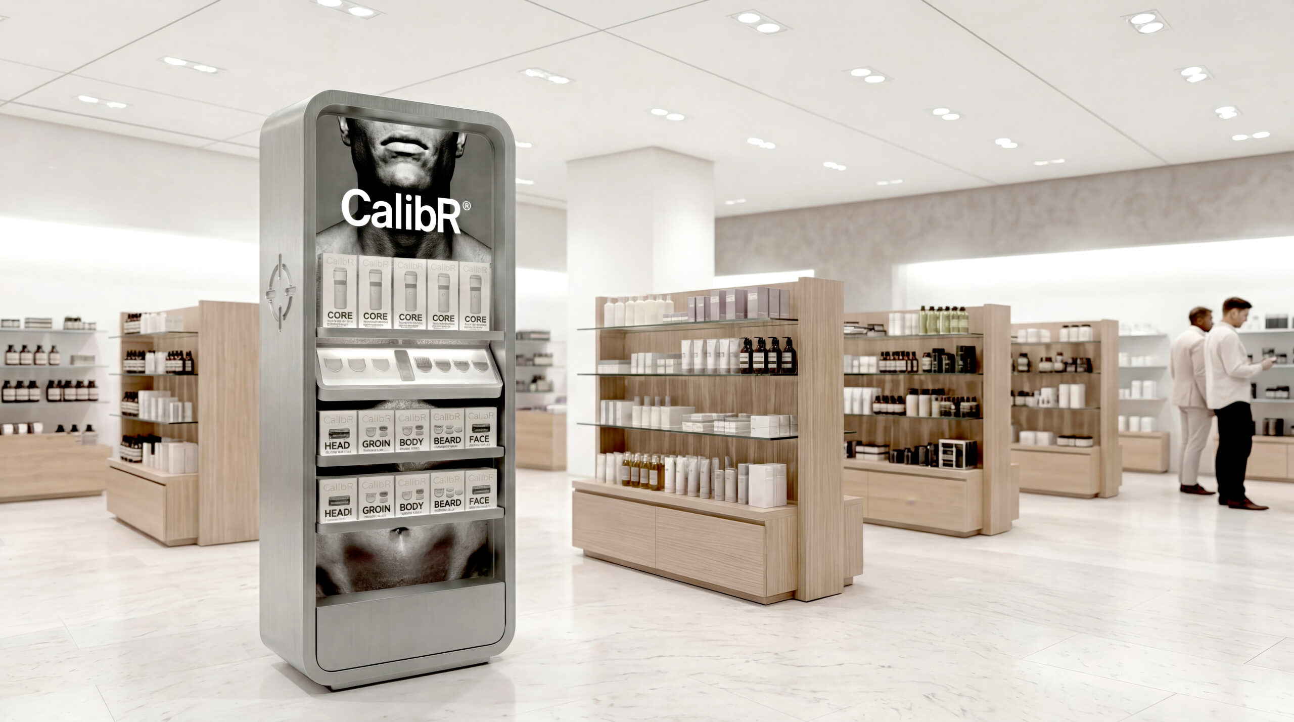
The floor fixture is the product at retail scale. Aluminum. Rounded corners. The same form language as the CORE unit — large enough to stop traffic, precise enough to close the sale.
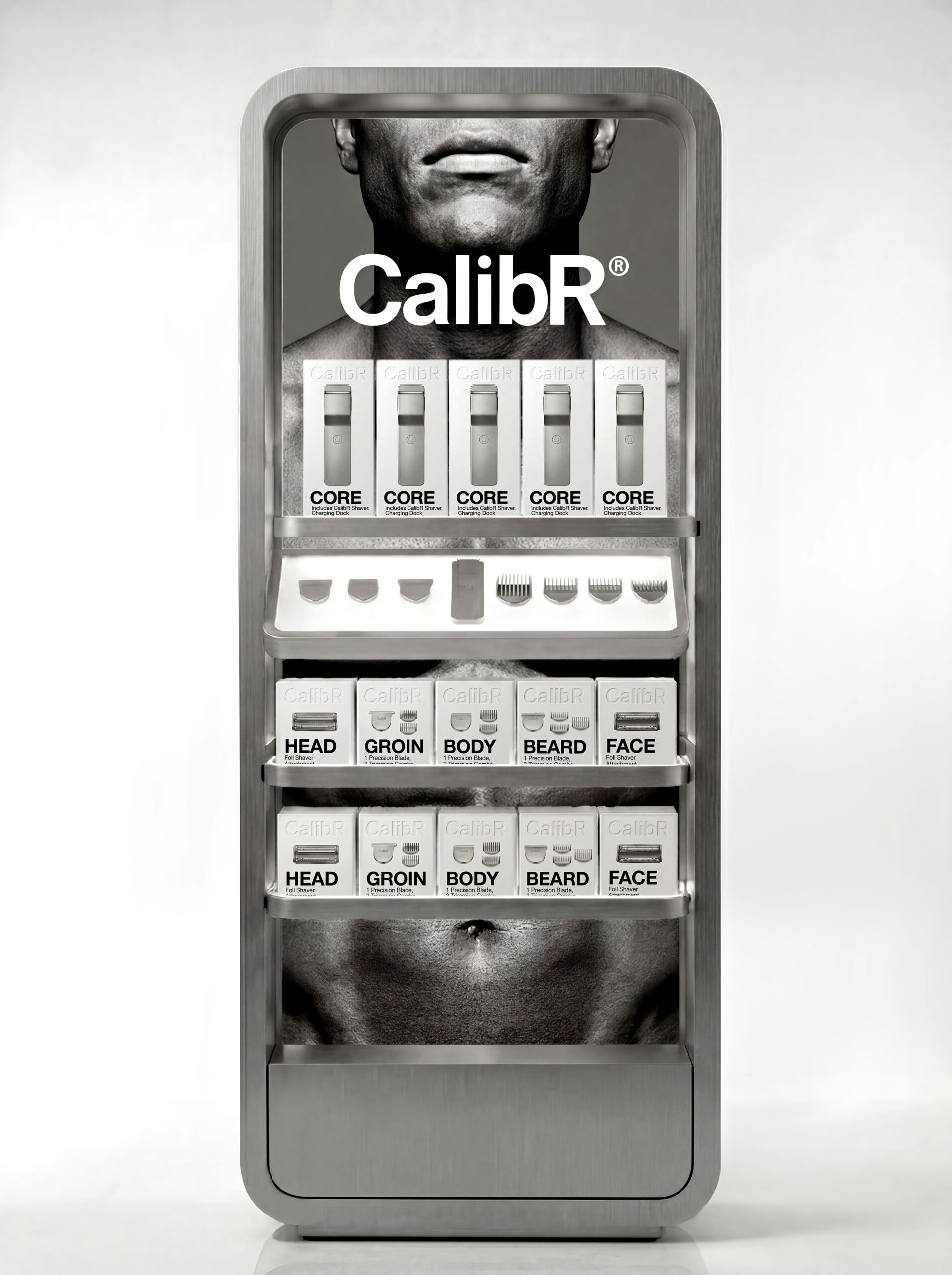
Front elevation — aluminum body, rounded corners, crosshair mark embossed into the the side of the column.
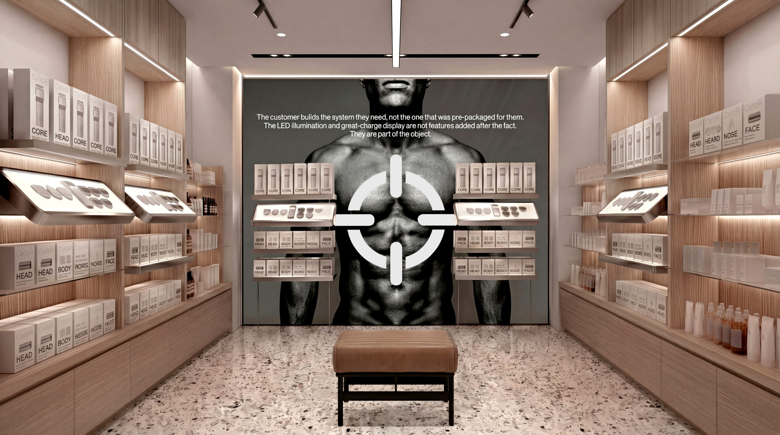
The floor fixture is the product at retail The crosshair at room scale does what no competitor can — it turns a wall into a statement of precision.
THE MARK AND LOGOTYPE
The mark is a calibration reticle — the instrument used to align a scope to an exact standard. But caliber means something more. It’s the word used when something sets the standard rather than meets it — the level of excellence a system establishes in its category.
The crosshair replaces the power symbol on the CORE unit — pressed into brushed aluminum, present every time the device is used. Not a logo applied to a product. A standard built into it.
On the fixture. On the device. The same mark at every scale.
The CalibR logotype carries all of it at once: the founder’s name, the precision of the instrument, and the standard the system sets in the market.
THE FOUNDER, CALIB ROSSI

Calib in the his studio
Calib Rossi built CalibR around a single frustration: every grooming tool on the market was designed for one zone, packaged for one use case, and priced as if multiplying the problem was the solution.
The flat aluminum tablet form factor came first — a handle that felt like a precision instrument rather than a consumer product. The modular head system followed directly from that premise. Six heads. One body. One decision at the counter instead of six.
The brand name was never a decision. It was already there.